Chatica
Website Redesign Goals
The aim is to enhance user experience, design, and accessibility, creating a more intuitive interface that boosts conversions and customer satisfaction.
By addressing usability issues like navigation, cart management, and filtering.
Make the site more engaging, professional, and aligned with current design trends.
Ensure full accessibility on all devices, with seamless mobile performance.
Competitor Analysis in the UK
I analyzed two of the main websites of competitors selling Latin products in the UK to identify opportunities for redesigning La Chatia’s website.
- Strengths
- Clean, modern interface with high-quality visuals.
- Well-organized categories for easy navigation.
- Fully responsive and seamless on all devices.
- Highlights deals and featured items effectively.
- Weaknesses
- Lacks educational or cultural elements, such as recipes or product stories.
- No advanced features like recommendations based on purchase history.
- Contact information is not easily accessible across the site.
- Strengths
- Specializes in Andean products (Market niche).
- Detailed product descriptions that help educate customers.
- Multiple payment methods and simplified checkout process.
- Provides additional value through recipes and tips for users.
- Weaknesses
- The design is less visually appealing compared to competitors.
- Category structure is confusing, making it harder to navigate.
- Pages load is slower than competitors.
- Some elements are misaligned or hard to select, impacting the mobile experience.
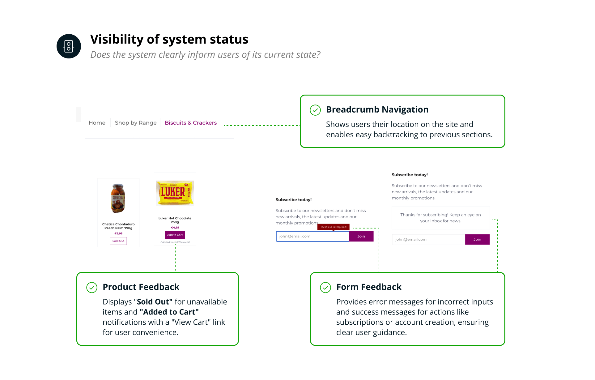
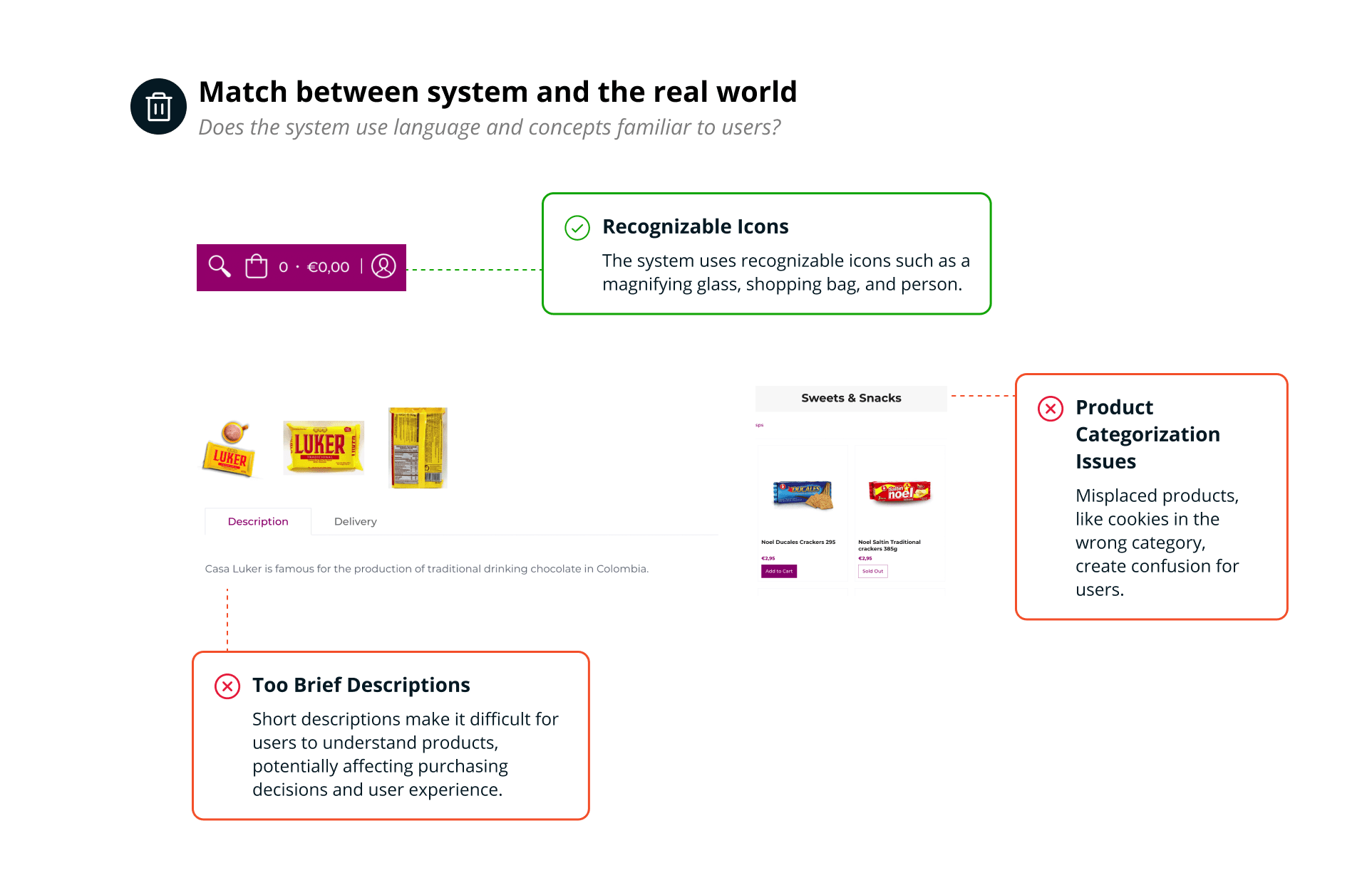
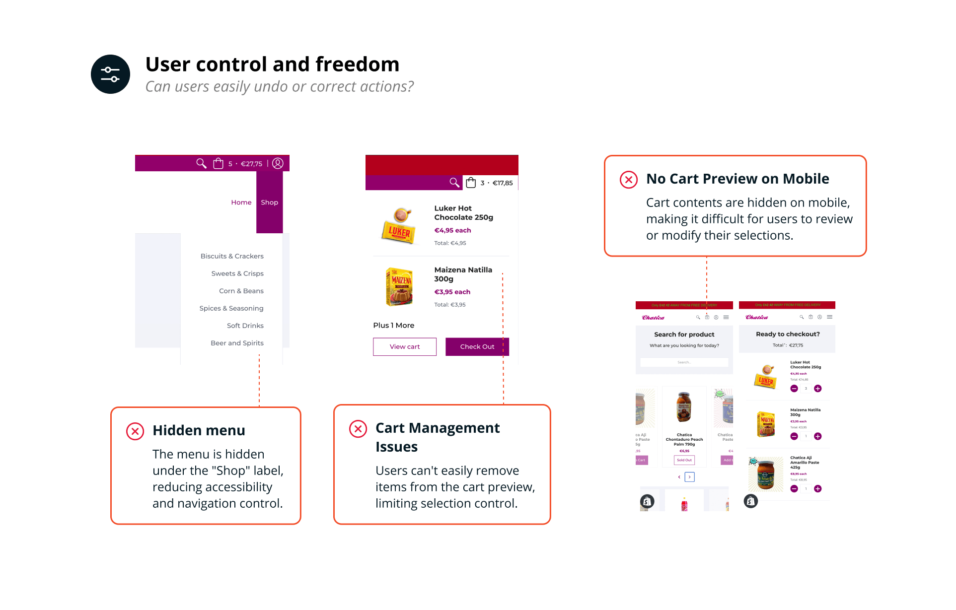
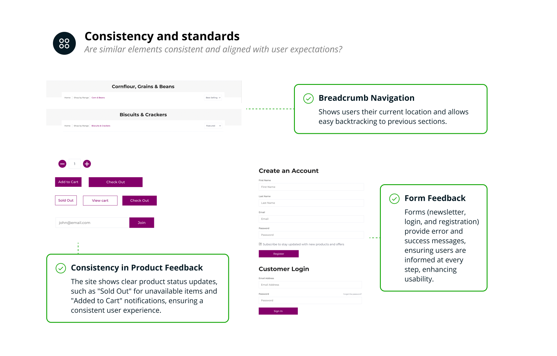
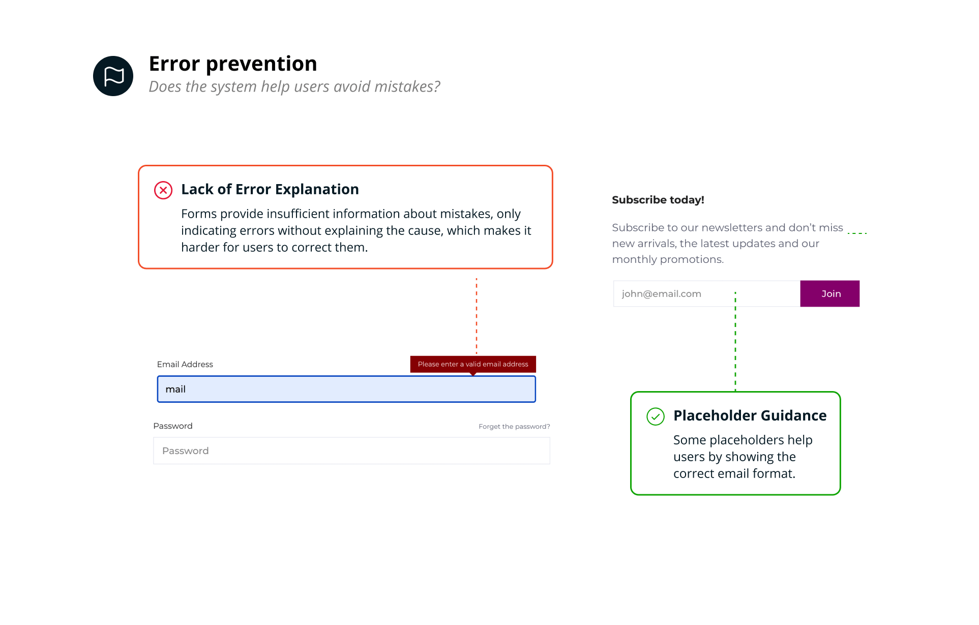
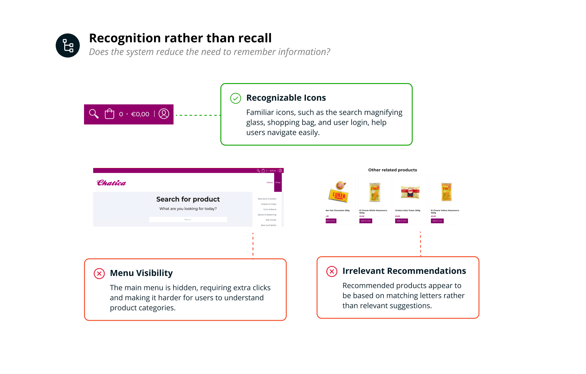
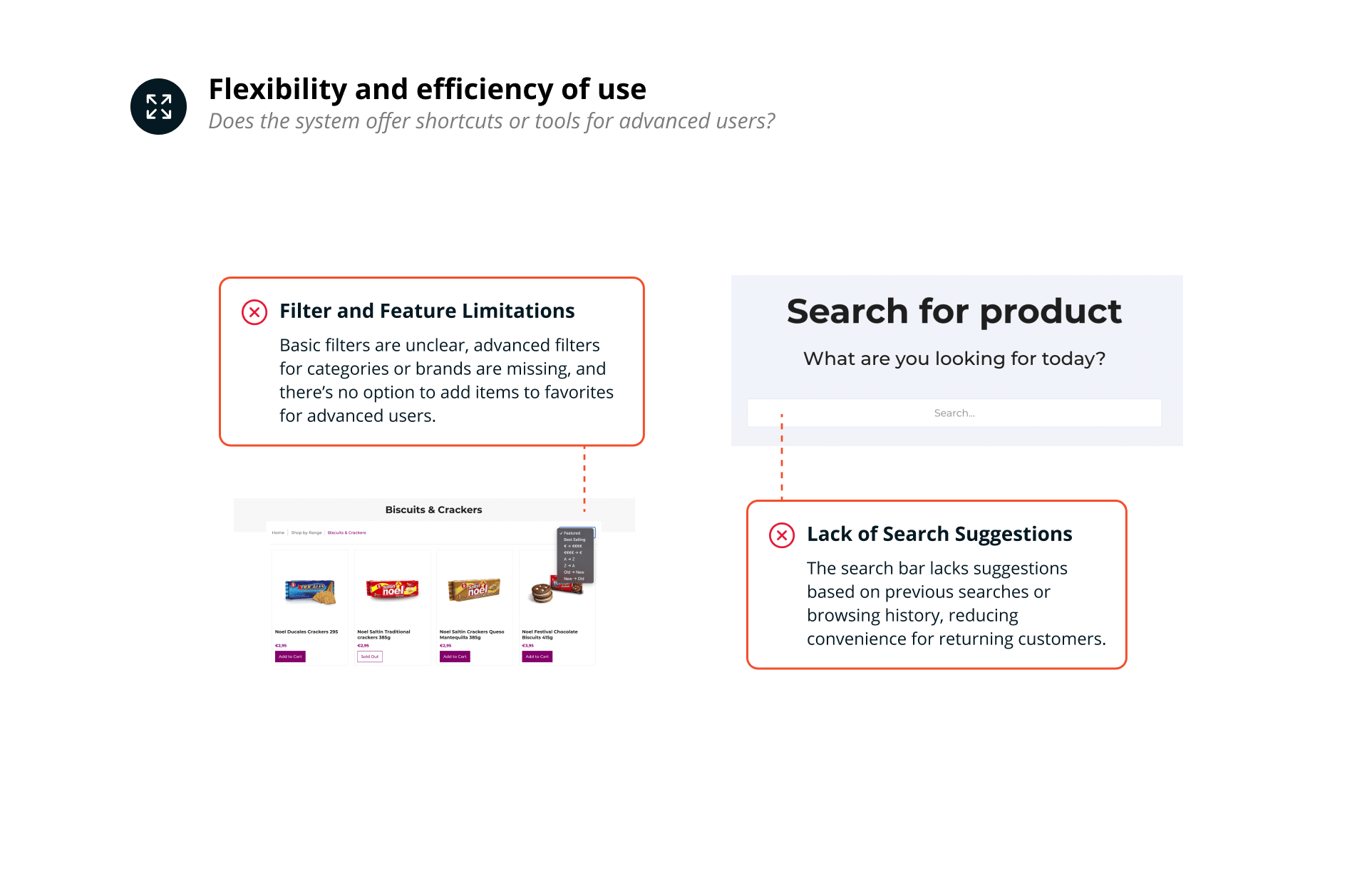
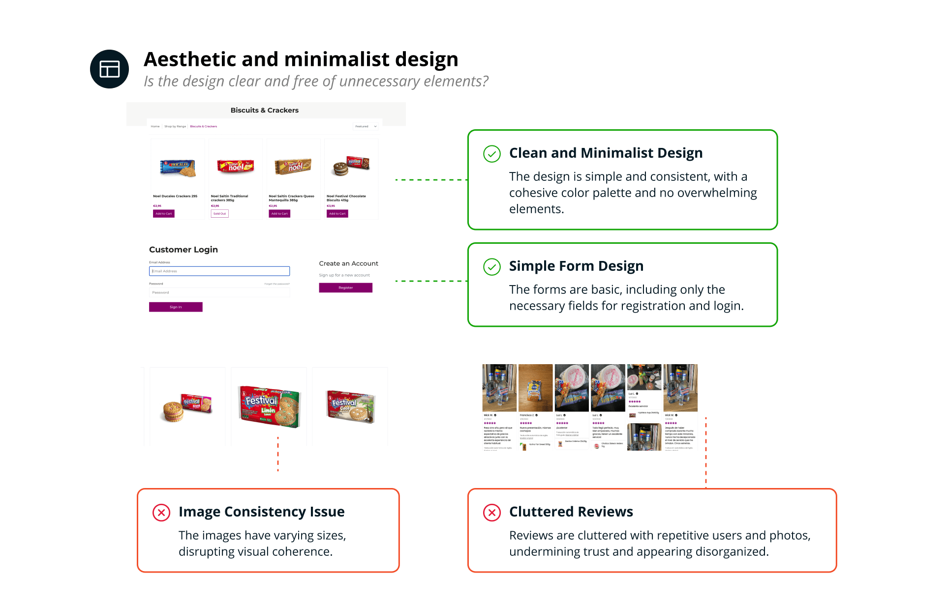
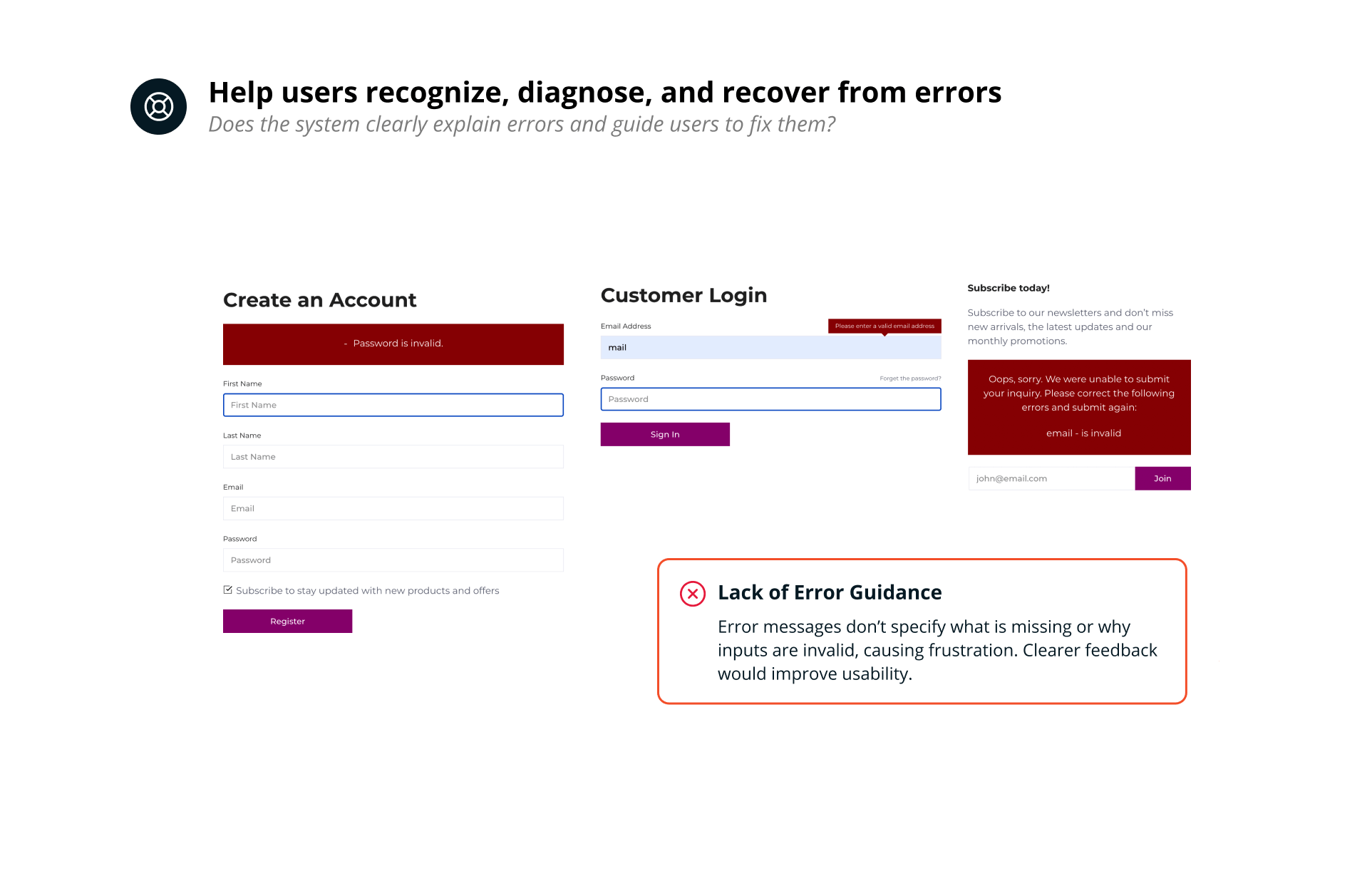
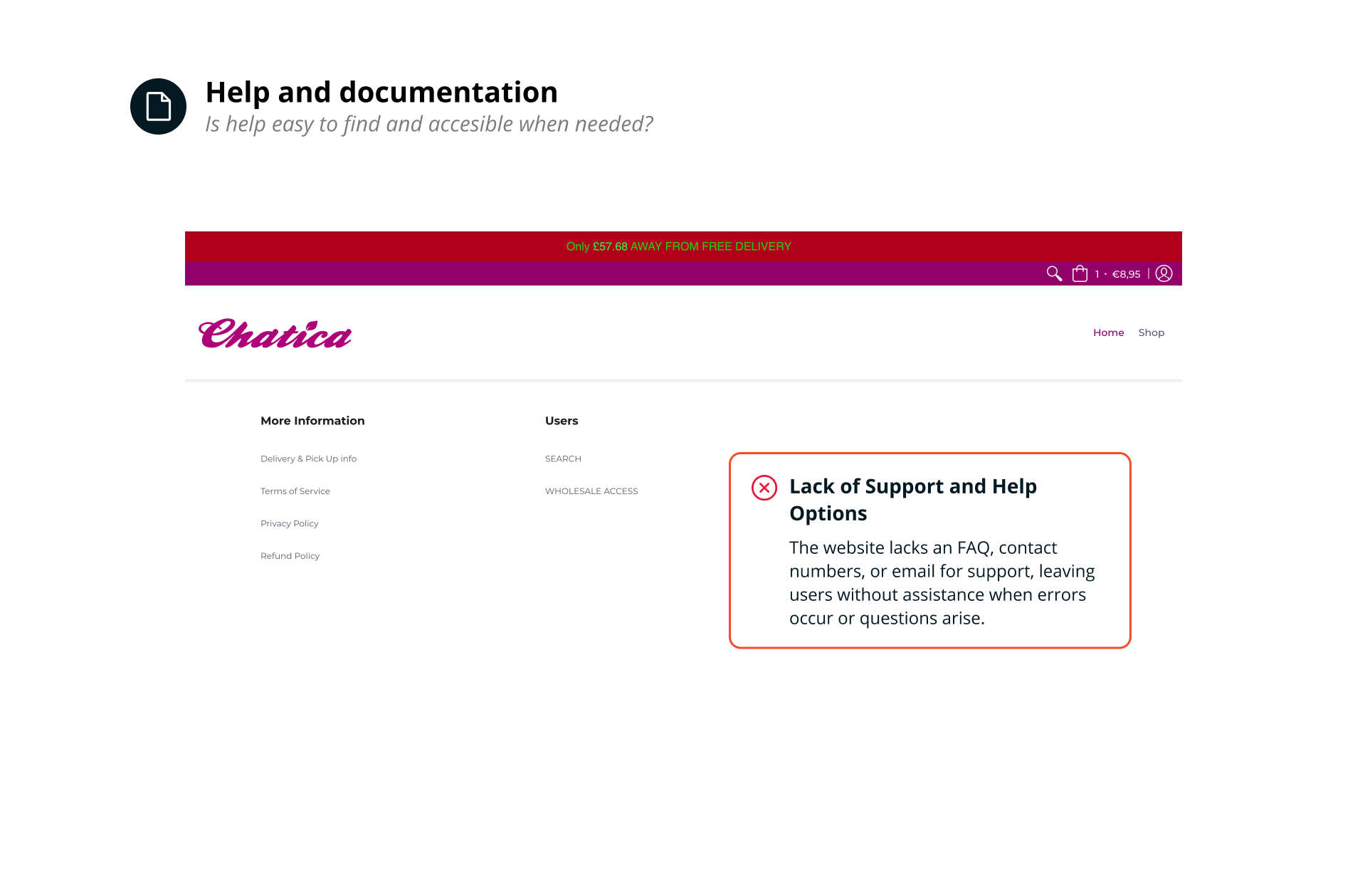
Heuristic Analysis Based on Nielsen's Principles
Analyzing the website using Nielsen’s heuristics to identify improvement opportunities and detect usability issues.
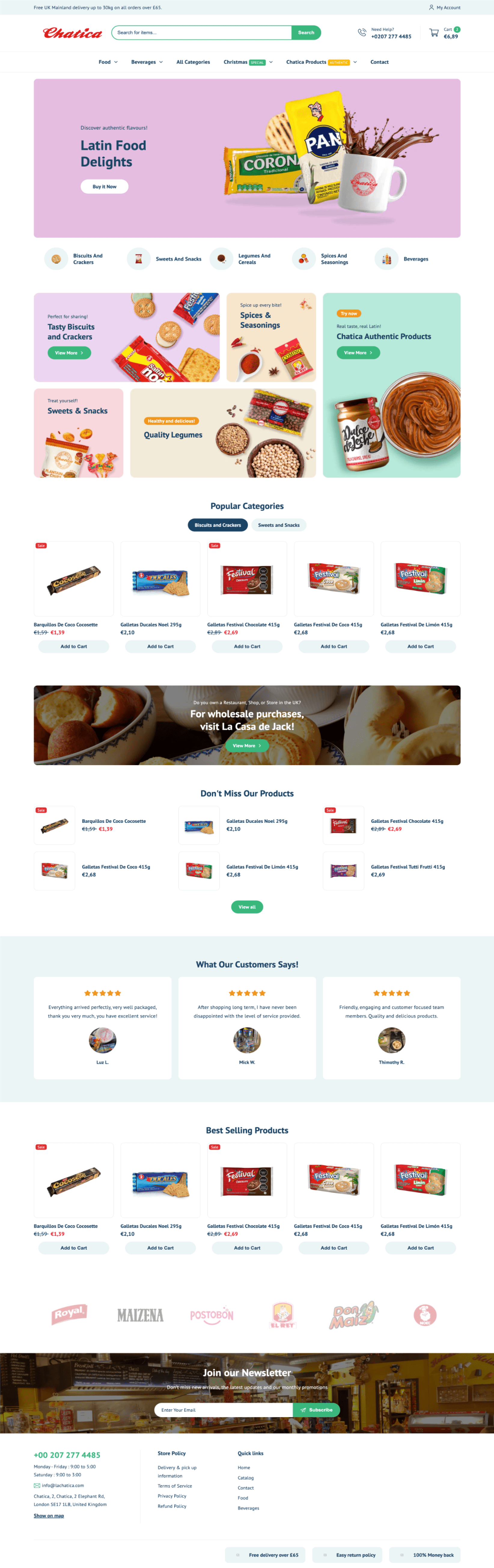
Final Deisgn Overview
What I learned
Heuristic Evaluation is a very effective tool for analyzing the strengths and weaknesses of a website in terms of user experience. Through this process, it’s possible to identify areas where a website excels and where it may fall short in providing a seamless, intuitive, and user-friendly experience. The evaluation helps in spotting usability issues that could potentially impact user satisfaction and engagement.
It’s crucial to guide the client in understanding the importance of thinking from the user’s perspective and considering their needs. Initially, the client only wanted to make aesthetic changes to the website. However, through effective communication, they came to understand that user experience (UX) is just as important. A positive UX will not only enhance how users interact with the website but will also have a significant impact on the brand’s image, the message they want to convey, and ultimately, their sales.